Advertising is indispensable for a company and is one of the most important means of communication in the marketing area. Nowadays, every person is confronted with thousands of advertising messages a day, often referring to a multimedia stimulus overload. How can your advertising attract the attention of potential customers and stand out from the flood of advertising??

Image: Africa Studio – Fotolia.com
In this two-part blog post, I show the main methods of advertising design that activate customers’ buying behavior through emotions and ultimately also influence their perception and action.
In this first part, I tell you something about the formal design means of advertising. Maybe they also offer additional or optimization potential for your advertising?
A part of the market research is advertising psychology, which deals more closely with the advertising effect and the reasons for buying of consumers. However, most purchase decisions are made unconsciously, so that advertising psychology often focuses on what people think and feel when viewing an advertisement.
There are various ways for you as an advertiser to individually design your own advertising in order to anchor the product in the minds of your customers. The typography, placement and the The use of colors and music play an important role in the formal design of advertising.
typography
Only advertising that is perceived can work. There are two different typographic aspects that contribute to the generation of attention.
Macro-typical design features
Macro-typical design features determine the arrangement of a text and its heading. The main priority is to ensure legibility, which can be influenced positively or negatively by different line widths and line spacing.
Texts that are justified can follow your eyes more fluently than texts in flapper. The headline should be interesting and short in order to ensure a clear statement and quick recording.
Microtypical design features
Among other things, microtypical features deal with with the font size and font. Problems can arise with various fonts, since these do not make the text appear as coherent words or are not suitable for emphasizing words as bold and italic fonts.
Typography plays an important role in advertising psychology because fonts can create certain moods in the recipient. Have you ever noticed for yourself that circular fonts are alive and well modern appear (e.g. Comic Sans) and a square font (e.g. Times New Roman) rather dignified and historical?
With simplicity and a clearly defined structure of your advertising texts, you can draw the recipient’s attention to your advertising medium. Use a font that reflects your company!
placement
When dividing and placing the advertising, it is very important to have the view path of a person (from left to right) in mind. The text should therefore always be arranged in the usual direction. Viewing an ad is based on the learning psychological laws of life, so helpful behaviors should be considered as the basis for the placement of a functioning advertisement.
In addition to the reading direction, it is also crucial that advertising posters are usually arranged in a Z-shape. The eye begins in the top left corner and leaves the advertising medium in the bottom right. It is therefore a good idea to place the company logo at the bottom right so that it remains in the mind of your potential customer.
color design
Color also plays an important role in formal advertising design.
What is your favourite colour? Or are there colors that you don’t like at all and therefore don’t really pay attention to? My absolute favorite color is pink and everything that catches my eye in this color gets my attention.
Colors arouse emotions
Colored advertisements are more effective than black and white advertisements, since a colored advertising design increases the memory performance of the recipients. Colors unconsciously aim at a feeling in us. In this way, you associate sensations such as warmth or love with the color red, while green represents hope or the environment.
The color scheme is multifunctional because it attracts attention, creates atmosphere and can highlight certain content.
Colors are decisive for the purchase
Everyone can find proof of the importance of color design for themselves when shopping in the supermarket. With so many items on the shelves, it is impossible to take a close look at each individual product due to time constraints. You are considering the product that appeals to you when you flew over the product range.
Pay attention to the signal effect of colors
Accordingly, the product packaging should have a corresponding signal effect. Warm colors are often used in the food sector, because viewing yellow, orange and red stimulates the taste buds, so that even the salivation increases. Organic products are often displayed in shades of green and brown to create an environmentally friendly impression. "Light" colors are used for light products: the low-fat curd light blue, while the curd with a higher fat content has a dark blue packaging.
A suitable color design for the product or company can therefore have a considerable impact on consumers’ purchasing decisions.
Use of music
Music is often used for advertising purposes, especially for TV and radio spots. Music can touch people inside, evoke experiences and associations and create a positive mood.
An advertising jingle should be linked to the still unknown company / product through frequent repetitions and should be permanently associated with the brand in the sense of classic conditioning.
Ideally, the positive mood triggered by the music is linked to the product. Almost every one of us can probably complete the sentence “Carglass repaired, Carglass….” Correctly and has the right advertising jingle in mind.
Music at the POS invites customers to linger
At the point of sale, too, music is increasingly used. Slow background music seems to extend the customer’s stay in the store.
Two examples:
A wine dealer has discovered that customers buy Italian wines more when Italian background music is played. This means that the Italian wine is subconsciously preferred to the French or German, without the customer having tried the wines in advance.
In spring, clothing stores often have summer hits the latest Played for years to evoke memories of the last vacation and thus trigger a desire to buy new vacation outfits.
The right advertising design activates your customers
The examples show the importance of a well thought-out advertising design for a company. The trick is to activate your customers through the optimal use of design measures and to trigger emotions in you. Your customer should feel involved and be able to identify with your product so that he discovers a clear advantage in the form of an additional benefit.
You can find further suggestions for content-related advertising in the second part of my blog series "The Power of Advertising".

By Verena Katernberg
Verena Katernberg works as a consultant for brand and event coordination at the FUNKE media group.
RELATED ITEMS
-
Article reading time approx .: 1 minutes, 55 seconds News-ID 174756 Geilenkirchen makes children strong with the Safe-Strong-Team! It was in Geilenkirchen…
-
Children learn to read, so everyone can learn to read for themselves: easy stories to learn to read
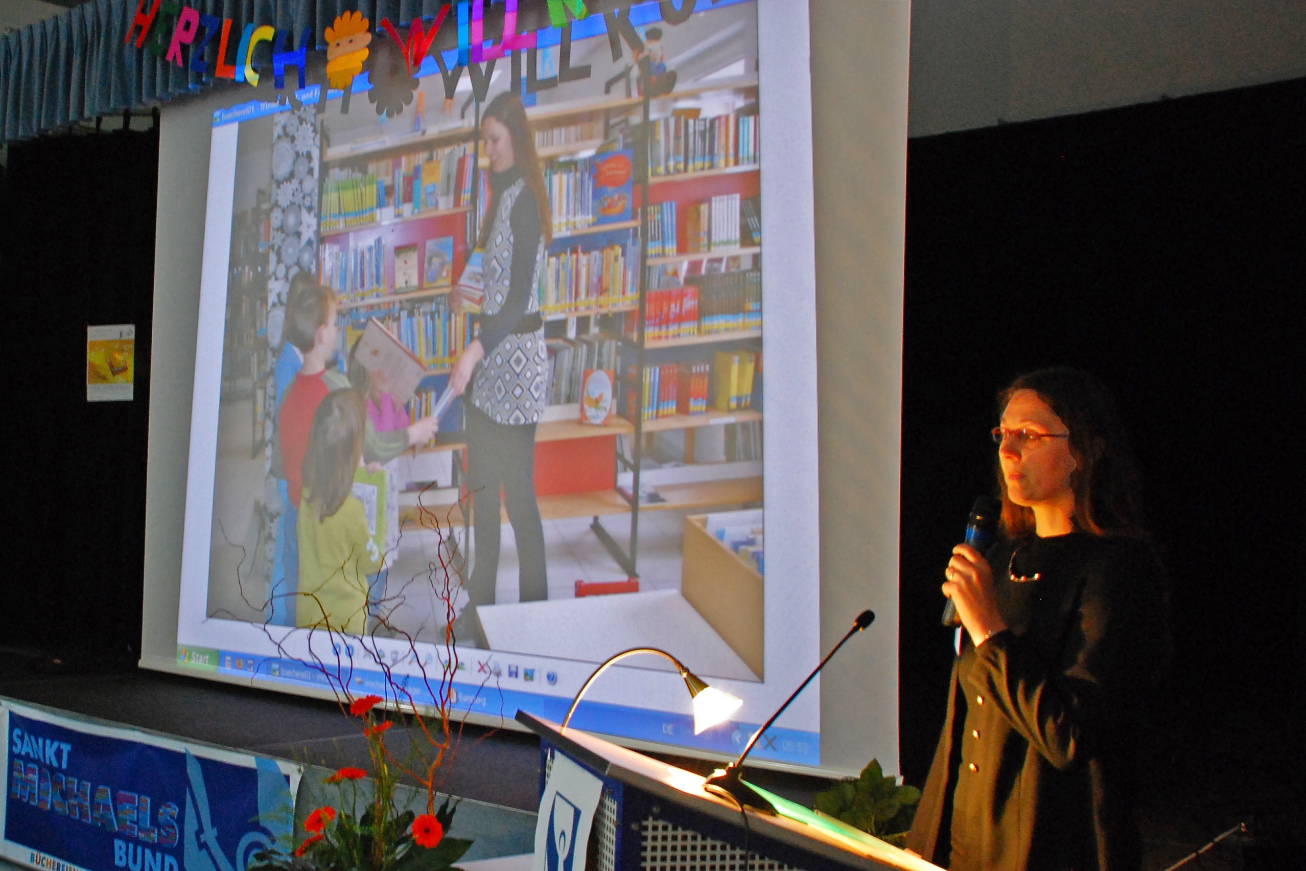
Photo: Dr. Rudolf Härtel (Sankt Michaelsbund BA) The importance of learning to read The strengthening of reading skills for all children is important to me. Who good…
-

Lent: practicing abstaining makes children fit for life
Reading time: 2 minutes of Lent is not just for adults. Even with children, you can take this time as an opportunity to practice doing without. Which gives…
-

How computer games make people happy
Adults often talk about computer games being bad for children. You must have noticed that before. But is it really like that?…